Color grading is your secret to deepening the emotional impact and style of your images. Start by understanding basic color theory—how colors interact and influence moods. Equip yourself with tools like DaVinci Resolve or Adobe Premiere Pro, ensuring your monitor displays colors accurately. Adjust contrast and brightness to sculpt light and shadow, enhancing texture and depth. Manipulate colors on the wheel to evoke specific feelings, using complementary schemes for vibrancy or analogous for harmony. As you experiment with these techniques, you'll find yourself not just editing, but storytelling through hues and saturations, shaping viewer experiences in subtle yet profound ways. More awaits as you refine your skills.
Understanding Color Grading

Color grading, at its core, is the art of manipulating the colors in your video footage to enhance its emotional impact and visual consistency. As you explore this world, you'll find that achieving color harmony is vital. This concept isn't just about matching colors pleasingly; it's about creating a balanced visual experience that supports the narrative of your footage.
Imagine you're working on a scene meant to evoke tranquility. You might lean towards cooler, softer hues to elicit calmness, ensuring that each element within the frame contributes to a cohesive color palette. Conversely, scenes charged with energy might demand bolder, more contrasting colors. This delicate balance is where your artistic intuition plays an important role.
However, while you manipulate hues and saturations, remember the ethics of grading. It's tempting to dramatically alter reality to suit your vision, but there's a thin line between enhancement and deception. Ethical grading respects the authenticity of the subject while subtly elevating the visual storytelling.
Essential Tools and Software
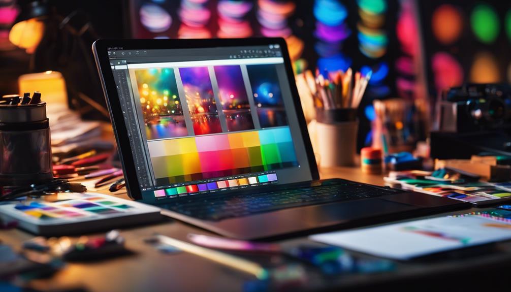
To immerse yourself in color grading effectively, you'll need to equip yourself with the right tools and software, each designed to refine and manipulate your footage's color palette with precision. It's important to select software that's compatible with your existing editing suite. Software compatibility guarantees a seamless workflow, allowing your color grading tools to integrate without hitches, thereby speeding up your editing process. Popular choices include DaVinci Resolve, known for its deep color manipulation capabilities, and Adobe Premiere Pro, which offers robust color correction features within a complete video editing environment.
Stay vigilant about tool updates; these are essential not only for security reasons but also for harnessing cutting-edge features that enhance your color grading artistry. Updates often include improved color wheels, more intuitive interfaces, and expanded libraries of color presets that mimic various cinematic styles.
Moreover, investing in quality color grading monitors and calibrated display devices will provide you with accurate color representation. This ensures that the colors you select are true to what viewers will experience across different screens. Remember, the right tools not only expand your creative palette but also refine your workflow, making your venture into color grading both enjoyable and professionally rewarding.
Basic Color Theory

Having equipped yourself with the right tools, let's now explore how different colors interact and the impact they have on your visual storytelling. Understanding basic color theory is essential as it informs the hue dynamics and color relationships that can either elevate or detract from your work.
Colors can be broadly categorized into three types: primary, secondary, and tertiary. The primary colors are red, blue, and yellow — fundamental hues from which other colors are derived. When you mix these, you get the secondary colors: green, orange, and purple. Tertiary colors are made by mixing primary and secondary colors, resulting in hues like red-orange or blue-green.
Here's a simple table to illustrate these relationships:
| Primary | Secondary | Tertiary |
|---|---|---|
| Red | Orange | Red-orange |
| Blue | Green | Blue-green |
| Yellow | Purple | Yellow-purple |
The Color Grading Workflow
Before diving into the technical steps of color grading, it's important to understand that this process involves creatively enhancing your visual content to evoke specific emotions or atmospheres. You're not just tweaking settings; you're setting the mood and style of your visuals.
To start, let's talk about hardware requirements. To efficiently handle the demands of color grading, you'll need a well-equipped workstation. A high-resolution, vital monitor is essential, as it allows you to see subtle hues and saturation levels clearly. Additionally, a powerful graphics card and a processor with high clock speeds will make certain that your software runs smoothly, especially when working with high-resolution video files.
Moving on to workflow optimization, establish a consistent method to approach your projects. Begin with importing and organizing your footage into your preferred editing software. This is where you create a timeline and prepare your clips for grading. Use tools like scopes and histograms to analyze your footage, ensuring you have a balanced image to start with. Remember, the goal here is to streamline your process so that you can focus more on the creative aspects of color grading rather than getting bogged down by technical inefficiencies.
Adjusting Contrast and Brightness

Once you've set up your workspace and organized your footage, adjusting the contrast and brightness becomes the next essential step in refining the visual impact of your project. By tweaking these elements, you're not just altering the image; you're sculpting the light, enhancing textures, and drawing out the mood of each scene.
Contrast manipulation allows you to define the relationship between the darkest and lightest parts of your image. Increasing contrast can make your image pop, but be careful—you don't want to lose detail in your highlights and shadows. Here's where highlight recovery comes into play, ensuring that you preserve details even in the brightest parts of your image.
Similarly, enhancing shadow detailing can unearth the subtleties hidden in darker areas, bringing depth and dimension to your footage. It's a delicate balance, as too much shadow enhancement can lead to a washed-out look.
Here's a quick reference table to guide you:
| Adjustment | Impact |
|---|---|
| Increase Contrast | Enhances overall pop; risks losing detail |
| Decrease Contrast | Softens image; increases detail retention |
| Brightness Up | Lifts overall exposure; watch for highlight loss |
| Brightness Down | Darkens image; enhances deep tones |
| Balance | Fine-tunes the interplay of light and dark |
Manipulating Color for Mood
Color manipulation, when skillfully applied, can dramatically alter the emotional landscape of your footage, steering viewer sentiment with each hue adjustment. As you immerse yourself in the world of color grading, understanding the essential, yet highly artistic, aspects of color harmony becomes vital.
Colors aren't just visual; they're emotional triggers. The shades you choose and their relationships can evoke feelings of sadness, joy, tension, or tranquility.
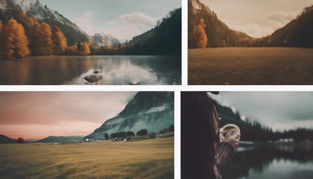
Let's consider a sunset scene. By enhancing the oranges and reds, you amplify a sense of warmth and comfort, harnessing these colors' ability to evoke nostalgia and peace. Conversely, shifting towards bluer, cooler tones might suggest isolation or melancholy. This is where your technical skills intertwine with artistic intuition. You're not just adjusting sliders; you're manipulating emotions.
Delving deeper, think about the color relationships in your scene. Complementary colors, when placed together, create vibrant, dynamic visuals that can heighten the emotional stakes of your footage. Analogous colors, on the other hand, offer a more harmonious and serene vibe, perfect for scenes requiring subtlety and calm. Mastering these color relationships allows you to craft a visual story that resonates on an emotional level, making your work profoundly impactful.
Creative Use of Color Wheels
Building on your understanding of color relationships, let's explore how the color wheel serves as a fundamental tool in crafting visually compelling scenes. The wheel dynamics involve understanding how colors interact, complement, or contrast with each other. As you explore further into color grading, you'll find that choosing the right palette can drastically alter the mood and tone of your images.
Start by selecting a dominant color that aligns with the desired emotion or theme of your scene. This color sets the tone for your palette selection. From there, use the color wheel to identify complementary or analogous colors. Complementary colors, found directly opposite each other on the wheel, create vibrant, dynamic compositions due to their high contrast. Analogous colors, which sit next to each other, offer a more harmonious and subtle visual experience.
When adjusting these hues in your grading software, pay attention to saturation and luminance. These elements can enhance or soften the impact of your chosen colors, refining the overall aesthetic. Experiment with different combinations, tweaking hues slightly to see how they interact under varying lighting conditions and with different background elements. This systematic approach allows you to develop a signature style that's both unique and visually engaging.
Color Grading Case Studies
To fully explore the practical applications of color grading, consider these detailed case studies that illustrate how different palettes and techniques have been used to achieve specific visual outcomes in film and photography. Let's delve into the work of industry pioneers, who've masterfully manipulated hues to evoke emotions and construct narratives.
One notable example is the film 'Amélie,' where director Jean-Pierre Jeunet and cinematographer Bruno Delbonnel used a rich, saturated palette to create a whimsical, almost magical ambiance. This deliberate choice enhanced the film's storytelling, pulling viewers into Amélie's vivid, imaginative world. The historical evolution of color grading can be seen here, moving from mere correction to an expressive, narrative tool.
Another case study involves the iconic 'The Matrix' series, where color grading played a critical role in differentiating the bleak, oppressive 'real world' from the vivid, more dynamic Matrix. Cinematographer Bill Pope and colorist Yvan Lucas opted for a green tint in the Matrix scenes, which not only set a stark visual contrast but also subtly hinted at the artificial nature of this environment. This technique showcased how color grading could be pivotal in enhancing thematic depth and audience engagement in cinematic storytelling.
Maintaining Consistency Across Images
Achieving a consistent color palette across your project's images is essential for maintaining a cohesive visual narrative. When you're tackling color grading, think of each photo not just as an individual piece, but as a part of a larger story you're telling. Scene matching becomes your go-to technique, guaranteeing that despite different lighting conditions or camera settings, the feel remains the same.
Start by identifying the key colors that define your project's mood. Are you aiming for warm, sun-kissed hues, or cool, shadowy tones? Once you've set this baseline, the next step is to adjust the individual images. Use color wheels, curves, and HSL (Hue, Saturation, Luminance) adjustments to align each photo with your chosen theme.
But it's not just about matching scenes; it's about creating Portfolio Uniformity. This means ensuring every image could belong in the same gallery without one appearing out of place. You'll want to keep an eye on your shadows, midtones, and highlights, making minute adjustments to maintain this uniformity.
Lastly, don't forget to consistently evaluate your work on different devices and in various lights. What looks perfect on one screen mightn't translate as well on another. This vigilance guarantees your portfolio's impact is both powerful and professional.
Frequently Asked Questions
How Does Color Grading Impact Black and White Photography?
Color grading plays a crucial role in black and white photography by enhancing tonal contrast and emotional depth.
You'll notice that adjusting shadows, midtones, and highlights can greatly alter the mood and style of your images.
This technique allows you to subtly influence viewers' emotions, creating a more profound narrative or aesthetic appeal in your photographs.
Mastering these adjustments can transform a simple shot into a striking piece of art, rich in detail and emotion.
Can Color Grading Fix Poorly Lit Photos?
Color grading can't entirely fix poorly lit photos, but it can help. You'll use lighting adjustments and exposure correction to enhance details hidden in the shadows or washed out by overexposure.
Is Color Grading Necessary for Social Media Uploads?
Color grading isn't strictly necessary for social media uploads, but it's incredibly advantageous. It allows you to maintain visual consistency and strengthen your brand identity across posts.
By manipulating hues and tones, you set a distinct mood and style that resonates with your audience. This technical enhancement refines your imagery, making it more compelling and professional.
How Do Different Display Technologies Affect Color Graded Images?
Different display technologies can have a notable impact on how your color-graded images appear. It's crucial to take into account display calibration and technological consistency across devices.
Each screen, from OLEDs to LCDs, interprets colors differently, which means your meticulously graded photos might look varied to others.
What Are the Ethical Considerations in Color Grading?
When you color grade, you're wielding immense power to reshape reality. It's essential to prioritize authenticity preservation, ensuring the true essence of the scene isn't lost.
Additionally, you must handle cultural elements with sensitivity, avoiding alterations that could misrepresent or offend. This balancing act not only respects the subjects and settings of your images but also upholds an artistic integrity that's essential in the nuanced world of visual storytelling.
Conclusion
Now that you've delved into the vibrant world of color grading, you're equipped to bring your photos from mundane to magnificent. Remember, the color wheel is your palette and your images are the canvas. Paint with boldness and precision, ensuring each hue sings in harmony.
As you tweak contrasts and hues, let your artistic flair lead the way to a consistent, stylish portfolio. Immerse yourself, the world of color grading awaits your unique touch!

